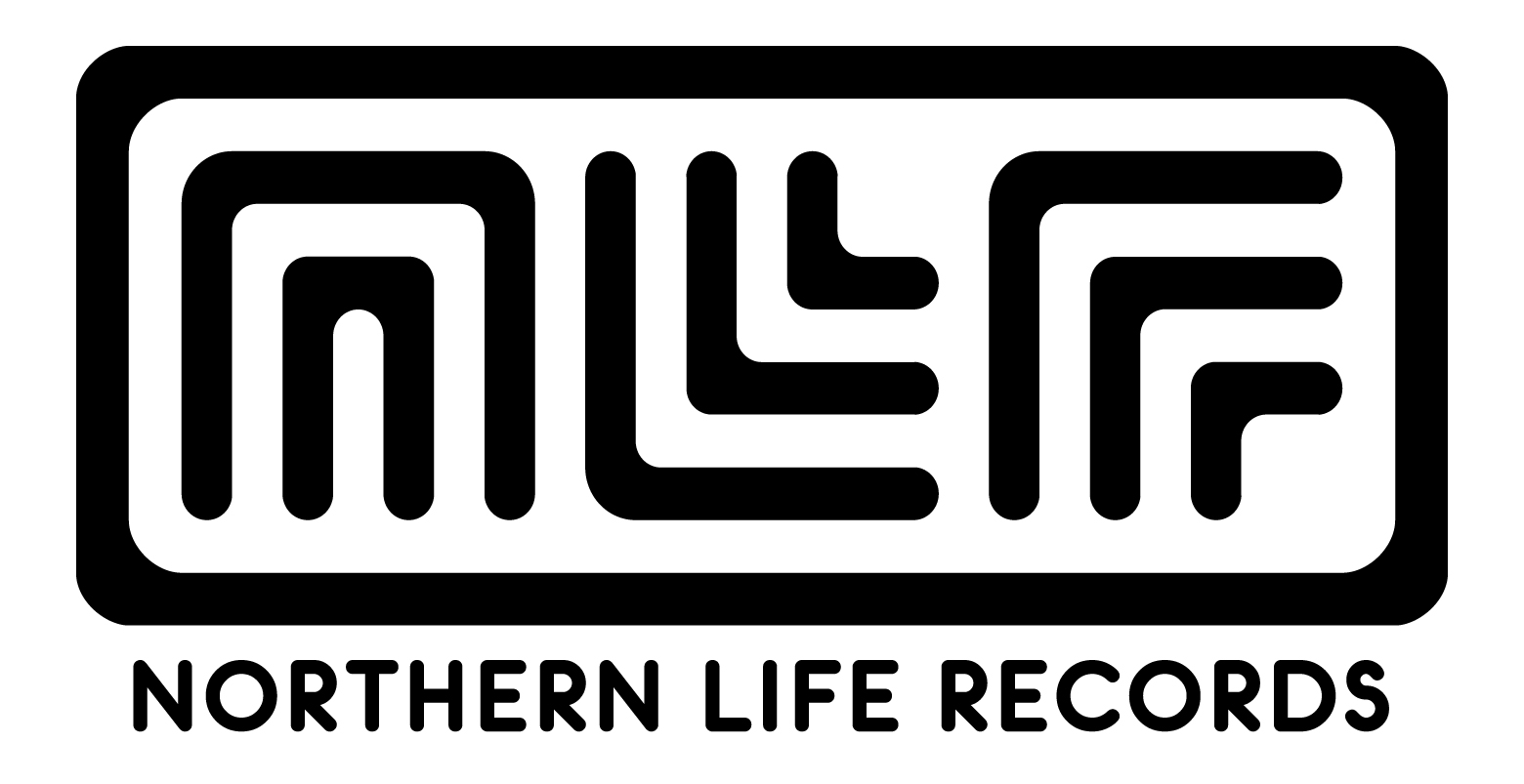
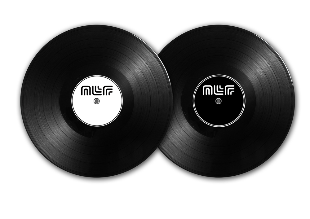
Northern Life Records Branding
Buy me
- Price: £0
I was recently commissioned by fellow Mancunian Naveed Akhtar of Northern Life Records to produce his record labels new branding. The label wanted to express their northern roots, particularly their Manchester roots. I jumped at the chance to exemplify the cities forward thinking and modernity, whilst bearing in mind the record labels own release history. I have known of the label for many years, having my first art studio was down the corridor in an old mill we used to rent a space in.
The branding became monotone, partly to reflect the outputs the label wanted to apply the outcomes, and partly to an aesthetic I wanted to project about the city and labels visual identity. I wanted to project clean lines, that are replicated through the three main Fonts of the logo, flowing in to each other but working collectively.
If you are interested in commissioning Switchopen to produce branding, logo design, please get in touch via our contact page, and we can discuss what you need.

